Our everyday routine is built on letters and fonts that we use to get our work done or express ourselves. If we were to pause and look at them a second too long, there is the danger of recognizing these fonts not just as a part of a word or sentence, but as evidence of human history.
The story of typography is as old as human history itself. In this post we will delve deep into its origin and share insights into its evolution.
- Early civilizations
Pictograms
The earliest forms of writing traces its roots back to pictograms – first discovered on cave walls (the oldest known cave paintings is a red hand stencil in Maltravieso cave, Cáceres, Spain, older than 64,000 years).
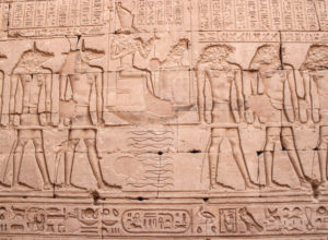
The next major step taken towards modern typography can be seen in the independently developed writing systems of the Near East, China, and Mesoamerica that shared considerable stability. The Mesopotamian cuneiform script dates back to prehistoric times to the eighth millennium BC, traced using clay tokens of multiple shapes. The evolution from tokens to script shows that writing emerged from counting to accounting. Writing was only used for accounting until the third millennium BC when the Sumerian concern in the afterlife paved the way for literature using writing to engrave funeral inscriptions. Around the same time, the first Egyptian inscriptions, dated to the late fourth millennium BC, were carved on royal tombs.
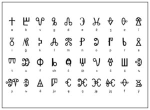
Around 1000 B.C. the Phoenicians gained their independence from the Egyptians and created the very first alphabet that comprised exclusively of letters.
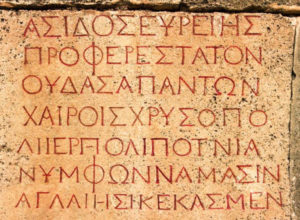
The Greeks then used the same alphabet and added the first five vowels to it. Even the word ‘Alphabet’ is a combination of Alpha and Beta – the first two Greek letters. Also, by 1600 B.C, Phoenicians developed phonograms – symbols used to represent spoken words.
These systems soon evolved into alphabets and phonographic writing, which led to the development of various typographic systems.
The Roman alphabet
From the Greek alphabet evolved the Etruscan alphabet and then after several years the Roman alphabet. It consisted of 23 letters, written with short finishing strokes at the end of letters, called serifs. Roman letters were the first to have a mix of thick and thin lines.

- Caroline Miniscule
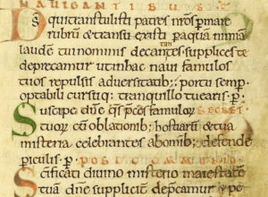
Originated before AD 778, Carolingian minuscule or Caroline minuscule was developed under the patronage of the First Holy Roman Emperor, Charlemagne the Great. It’s a script which developed as a calligraphic standard in the medieval European period so that the Roman alphabet of Jerome’s Vulgate Bible could be easily recognized by the literate class across different regions.
This new script was significantly more legible than the scripts used by Romans or that of the script earlier in the Middle Ages, and offered new features such as word spacing, more punctuation, an introduction of lower-case letters, and conventions such as usage of upper-case for titles, a mix of upper and lower case for subtitles, and lower case for the body of a text.
- Invention of the Printing Press

Johannes Gutenberg invented the first movable typeface in the early 15th century in Germany. Instead of using woodblocks, he used metal since the metal block letters could be moved around to create new words and sentences. Before Gutenberg’s invention, every book had to be copied by hand. His invention made the mass production of books possible without sacrificing quality. The high quality and relatively low price established the typographical dominance of European languages.
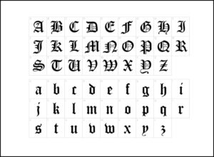
In 1455, Gutenberg carved the first typeface in the style of Blackletter – known as Gothic script today, while printing his 42-line Bible.
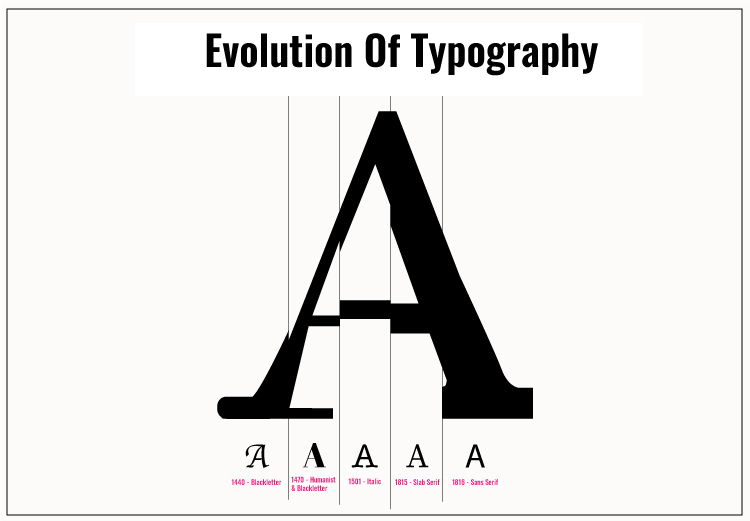
Blackletter (Gothic script) 1150 – 17th century

Blackletter was a script used throughout Western Europe from approximately 1150 until the 17th century. It continued to be commonly used for the Danish, Norwegian, and Swedish languages until the 1870s, and for the German language until the 1940s, when Hitler’s distaste for the supposedly “Jewish-influenced” script saw it officially discontinued in 1941. The Blackletter was dark and intense but difficult to read.
Roman typeface
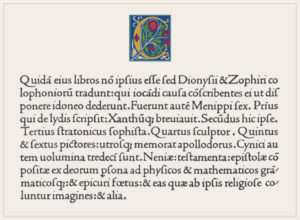
In 1470, Nicolas Jenson created the Roman Type which was his most impressive achievement and the reason why his name is still known. His Roman type was inspired by the lettering on ancient Roman buildings. Roman Type was much more readable as it was designed by combining Italian Humanist lettering with Blackletter typefaces.
The first printing typeface
In 1490, Claude Garamond introduced the first printing typeface. Its design was based on rigid geometric principles. The Garamond font is still in use today. It uses the least amount of ink when printed out on paper.
The Timeline of Font Styles
1501 – Italic
Francesco Griffo and Aldus Manutius created the first italic typeface which allows printers to fit more text onto one page.
1557 – Cursive
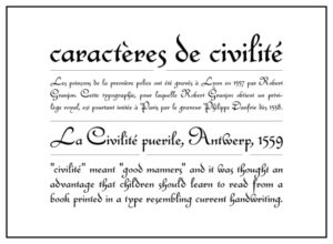
Robert Granjon invented the first cursive typeface, intended to stimulate the style of handwriting.
1734 – Old Style

William Caslon created a typeface with more contrast between strokes and what is now known as “old style”.
1757 – Transitional Roman
John Baskerville invented Transitional Roman typefaces, which had very sharp serifs and with even more contrast compared to the old style typeface.
1780 – “Modern” Roman
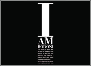
Along with Giambattista Bodoni, Firmin Didot created typefaces ‘”Modern’” style of serif typefaces and named after themselves as Didot and Bodoni respectively. These typefaces are characterized by extreme contrast in thick strokes and thin strokes, by the use of hairline serifs and by the vertical stress of the letters. You can see these font styles on magazine covers these days.
1815 – Slab Serif
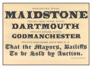
Vincent Figgins, the first known typefounder who created the first Egyptian or Slab Serif that we now see in many modern fonts. The typeface consists of thick block “slab” serifs at the ends of the strokes.
1816 – Sans Serif
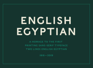
Sans-serif typefaces have become the most prevalent for display of text on computer screens. However, when William Caslon IV created the first typeface in 1816, it was widely ridiculed at the time.
- 20th Century Typefaces
Most of the typefaces developed in the 20th century are the ones which we still use today.
In 1920, Frederic Goudy became the first full time designer and designed numerous typefaces such as Broadway, Copperplate Gothic, and Goudy Old Style. And his created iconic fonts are still in use, including Copperplate Gothic and Goudy Old Style (based on Jenson’s Old Style typefaces).
Five years later, Herbert Bayer designed the Bauhaus font in 1925 when he was appointed the head of a newly created workshop for print and advertising at the Dessau Bahau.
In 1931, Stanley Morison criticized ‘The Times’ newspaper for staying out-of-touch with modern typographical font trends. That’s when he was commissioned to create an easy-to-read typeface for ‘The Times’ publications. The end result was Times New Roman typeface.
Max Miedinger, a Swiss typeface designer, created the Neue Haas Grotesk typeface in 1957 which was later renamed Helvetica in 1960. This typeface was marketed as a symbol of cutting-edge Swiss technology and achieved immediate global success. Other minimalistic designs such as the modern sans serif typeface, including Futura emerged around this time.
- Digital Typefaces
1n 1968, Rudolf Hell designed Digi Grotesk – the first digital typeface. Earlier, the digital fonts were bitmaps which were small in size and not ideal for readability. In 1974, the first outline fonts were developed with reduced file sizes and better readability at the same time.
In the late 1980s, TrueType fonts were invented which allowed to use a single file for both computer displays as well as output devices like printers.
Matthew Carter, in 1996, invented Verdana and Georgia for Microsoft. These fonts were specifically made to be extremely readable even when set to small sizes on a computer screen.
In 1997, OpenType fonts were designed for both Mac and PC platforms which allowed to use a single font file. CSS also incorporated the first-ever font styling rules in the same year. And a year later, the first support for web fonts was added to Internet Explorer 4.
Calibri Typography – one of the most widely used and recent fonts – was designed by Luc(as) de Groot in 2002-2004 for Microsoft and replaced Arial as the default typeface from Office 2007 onwards.
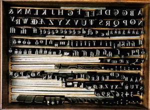
Bonus information- Letraset (Dry transfer)
In 1959, the Letraset business was founded in 1959 – introducing innovative media for advertisers and designers. Their original product was the Letraset Type Lettering System. Originally, Letraset referred to sheets of transfer lettering which were manufactured as a wet process. However, in 1961, the process was simplified to a dry transferable lettering system.
Before the dawn of phototyping and laser computer techniques, the Letraset technique was widespread for lettering and other elements. Moreover, Lorem Ipsum filler text has been featured on Letraset advertisements for decades and that’s how Lorem Ipsum gained popularity.