When it comes to product packaging labels, topography stands side by side with color and imagery in their role to grab the consumer’s attention, communicating the product information and conveying brand message. It is the style and art of arranging the text to make it readable and appealing in display. Think of it as an exclusive art wherein designers specialized in it must seek to maintain an equilibrium between visual and written elements for an effective packaging design. It helps in defining the brand with clarity and setting the proper tone to sell the product.
Importance of typography
In Packaging Design: Successful Product Branding From Concept to Shelf, it is explained that “typography for packaging design communicates the marketing message on a three-dimensional medium, is initially viewed from a distance, and is viewed by people of varying cultural, social, and ethnic backgrounds – all in a short amount of time…”
Typography is important for packaging because it makes sure that the information on products can be read easily, which helps to boost brand recognition and improves return on investment.
Aids in positioning brand
Typography helps to determine a brand’s identity. For instance, the selection of typography will help place emphasis on certain attributes or aspects of a product that the company wants the customer to perceive when looking at the brand. The way it composes the text on the packaging and promotional material can reveal an idea about what kind of brand it is trying to convey or represent. It is a designer’s responsibility to address these matters so that customers will be able to perceive the intended message with clarity.
Helps differentiate brand
It is easy to notice how type looks different from one product to another. This is primarily for the reason that companies go out of their way to make sure their products stand out and are easily distinguishable as customers are browsing through products on the shelf. And to achieve it, brands make a deliberate effort on their part to undertake a comprehensive study of consumer behavior before finalizing on the choice and composition of typography, or even whole packaging for that matter.
Grabs customer attention
It’s common knowledge that the first thing one notices about a product is its packaging. This can mean they’ll either pick it up or walk away and never look back. Here typography Plays a vital role in capturing your audience’s attention long enough so that the other aspects of packaging design may entice them to pick up the product.
Creates hierarchy
Carrie Cousins, web designer, says “Hierarchy gives readers a sense of how to actually read material from start to finish with visual cues and flow”. Typography thus directs customers’ eyes around packaging in order to focus their attention on the brand name, product type and description more than the ingredients and instructions. This is a smart marketing strategy which puts emphasis on what matters most to a customer to buy the product with confidence that it’s worth the purchase.
Famous brands with unique typography
Think of typical everyday products, such as toothpaste, laundry detergent and even peanut butter, and how their labels affect the feelings they invoke. A bright smiley face can make one trust in toothpaste more than if it were only the name of the brand or product on the label. That’s because our brain has been taught to associate symmetrical shapes with positive emotions and repulsion towards asymmetry. What about quirky, hand-drawn typography? Those are also designed to grab customer attention subconsciously by imitating handwriting. One can be surprised at just how powerful these factors are at influencing our buying decisions day after day – whether we’re conscious of them or not! Here are some famous brands who leveraged typography with all its nuances to set them apart from others.
Dove
One of the highest selling shampoo producers, Dove uses images of neither ingredients nor women on its labels. It is text oriented and focused on sending the message through their beautiful typography.

Burger King
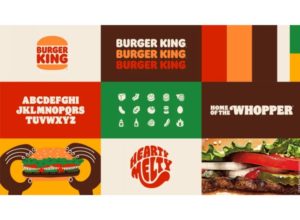
Burger King is among the most recognized brands in the world. Its recent rebranding effort, a totally “retro-feel” approach draws inspiration from the decade of the 1960s and 1970s when everything was basically playful and carefree. The typeface itself is rounded, stretched, and wavey but always maintains consistency in its overall presentation. In fact, it resembles very much Burger King’s original branding as well as its outward imagery when using this typeface which makes for a more unified brand presence across all channels of communication.
Plenty
Indoor vertical farming company Plenty has taken cues from the fast-food world for its unusual salad packaging. The red, yellow and purple color scheme along with choice of fonts evokes some of the biggest fast-food brands in the world, which helps to draw customers in through familiarity. It also distinguishes Plenty from others in the packaged salad category.
Typography helps a brand to differentiate itself. The best way to determine what fonts one wants or doesn’t want is by figuring out the type of buyer that is most likely to be interested in buying the product. If there are certain fonts that come along with images that are suitable for including on packaging, then use them! As fonts, sizes, colors and even the combination of different fonts go a long way in expressing a mood, establishing a style and creating an emotional connection with consumers.