Let’s start with a joke!
Helvetica, Times New Roman and Comic Sans walk into a bar. The barman turns to Comic Sans and says, ‘Sorry we don’t serve your type in here.’
Well, the barman may not like to serve them, but fonts (of all types and sizes) serve us all. They shape the visual language of the world.
We are all font consumers: we all interact with, and consume, a vast array of fonts every day of our lives and most of the time we do this without being consciously aware of it. They influence what we read and affect our choices because we all instinctively understand what is communicating to us, and we have been learning to interpret the references all our lives.
Understanding the basics
What are the seven typeface classifications?
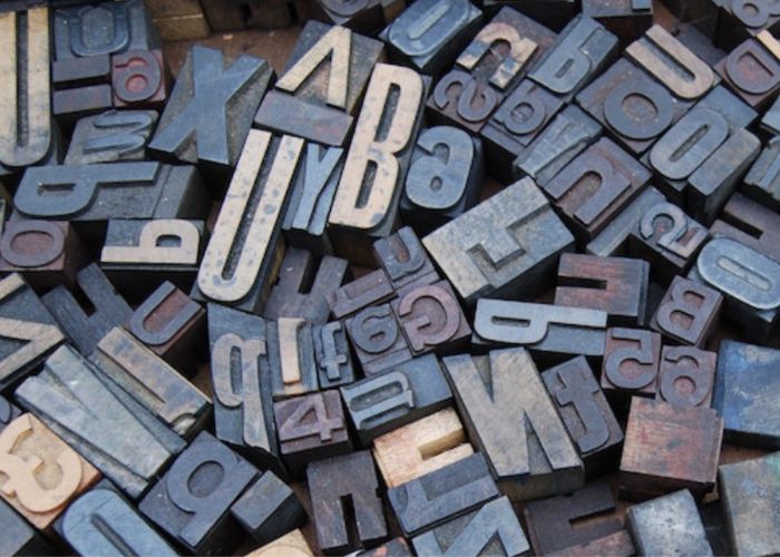
While there is no definitive list of the classifications of typefaces, there are seven that are generally recognized: serif, sans serif, script, blackletter, display, monospaced, and symbol or ornamental. Blackletter typefaces were the first in typeface history, followed by serifs and sans serifs.
What was the first font?
The first typeface was a Blackletter variety used by Johannes Gutenberg on the first printing press, starting in 1440. This typeface design was created to mimic the calligraphic handwriting used by monks to hand-transcribe manuscripts prior to the invention of the printing press.
When was typography first used?
The first historical typeface design that followed typographic principles was Nicolas Jenson’s Roman-style typeface, designed in 1470. Before Jenson’s design, typefaces and book designs were modeled after handwritten manuscripts that predated the invention of the printing press.
How do you describe a typeface?
Typefaces can be described with a few criteria: their classification (serif, sans serif), letter shape (geometric, condensed), mood (formal, casual), suitability for different types of text (headlines, body copy), and things like weight (thin, bold) or style (italic, oblique).
What were the first typefaces based on?
The first commercial typeface styles—called Blackletter—were based on handwritten manuscripts created by monks prior to the invention of the printing press by Johannes Gutenberg in 1440. The letterforms closely resembled calligraphy, with complex shapes and ornamentation.
How are fonts made?
Creating a font is a complex artistic and technical process. The first step is coming up with a concept that is fresh, interesting, or fills a gap in the market. Sketching comes next, often on paper. After letters are sketched, they’re digitized using software, then refined.
Written history
Humans have been communicating with symbols and pictures for over 5,000 years. Printing, however, started to take shape during the Han Dynasty (206 BCE-220 CE). Described as one of China’s Four Great Inventions, the Chinese discovered how to print on paper using blocks of wood and other materials. By the 11th century, the Chinese and Koreans were using an early form of moveable type – single, raised characters on pieces of clay that could be rearranged and used to impress ink onto paper.
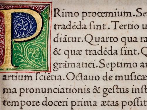
Jenson’s Roman typeface.
But it was not until the 1440s, when Johannes Gutenberg invented the Gutenberg press, that moveable type and printing became a worldwide phenomenon. The development of typefaces since then has been influenced by cultural, social, and technological factors. Early typefaces, such as Old Style and Transitional, were designed to mimic handwritten manuscripts, while later styles, such as Modern and Sans Serif, were developed as a response to evolving tastes and printing technology.
Present industry landscape
The digital revolution radically transformed the font landscape. Computers introduced pixel-based fonts, requiring meticulous translation of existing designs and paving the way for entirely new digital creations.
We see letters on screen, street signs, or car dashboards- each font we encounter, whether bold and attention-grabbing or subtle and elegant, has been meticulously crafted by a skilled designer.
However, for numerous independent font creators, breaking into this market can seem like an overwhelming hurdle, all thanks to the industry giants that hold unparalleled dominance, such as Monotype.

A type-casting machine patent filed by Monotype founder Tolbert Lanston.
Monotype’s roots can be traced back to Johannes Gutenberg’s revolutionary printing press in 1440. The company was founded in Philadelphia by Tolbert Lanston, whose monotype machine invention allowed for increased speed and efficiency when producing type. Over the next few decades, Monotype, by then with branches in the US and the UK, developed popular typefaces such as Gill Sans, Perpetua, and Times New Roman.
Monotype’s monopoly: a multi-pronged approach
Monotype’s dominance can be attributed to a multi-pronged approach:
Acquisition Spree
Over the years, Monotype strategically acquired several key players in the font industry, including Linotype, ITC, and Ascender Corporation. This not only expanded their own typeface library but also eliminated major competitors.
Technological Innovation
Monotype actively invests in font technology, developing advancements like OpenType fonts, variable fonts, and web fonts. These innovations enhance the functionality and versatility of fonts, catering to modern design needs.
Subscription Model
Instead of individual font sales, Monotype pioneered the subscription model, offering access to vast libraries for a monthly or annual fee. This provided designers with greater flexibility and cost-effectiveness.
Collaborative Ecosystem
Monotype fosters a collaborative community of designers and developers, providing tools and resources that encourage innovation and adoption of their fonts.
Independent Designer’s Dilemma
While boutique foundries still exist and do work for big companies, Monotype owns most major fonts: Arial, Helvetica, Gotham, Times New Roman. Its main competitors are Adobe Fonts and Google Fonts, the latter of which give away fonts for free.
In addition to the giants, there are thousands of other designers, some hobbyists and some full-time font makers, who try to sell their typefaces. However, many of these designers find themselves tethered to Monotype’s platforms.
For instance, MyFonts, with its 4,500 foundries and over 250,000 typefaces, has become a go-to marketplace. But the price of fame is steep; Monotype claims a hefty 50% commission on every sale, leaving designers with limited alternatives.
What the future holds
While Monotype currently holds a dominant position, the future of fonts remains dynamic. Open-source font communities are flourishing, challenging the traditional models and offering unique, alternative options.
The rise of artificial intelligence in font creation presents both challenges and opportunities. While some may worry about the future, many believe that the artistry and craftsmanship of font design will always hold a unique and irreplaceable place in our visual world.
Shaping the Visual Language of Our World
In this ever-changing landscape, font designers, whether independent or partnered with Monotype, continue to play a pivotal role in shaping the visual language that surrounds us. However, the future remains open, with new players and technologies emerging to challenge the status quo. Whether Monotype maintains its leadership, or a new font revolution unfolds, one thing is certain: the fascinating story of fonts is far from over.
Machine Dalal is a global platform for buyers and sellers to connect and trade their equipment with ease. Contact us to learn more.
Check out our apps on Android or iOS smartphone.
GLOSSARY
TYPE – originally, a small piece of metal containing a single raised letter or character that can be arranged to print words onto paper
TYPEFACE – a set of letters that share a common design, such as Times New Roman and Comic Sans
FONT – variations within a typeface. A font describes a set of letters that share a common design, including its size, weight, style and character set (Roman, Cyrillic or Greek).